Do FAQ Pages Right: 5 Great Examples (With How To)
Written by Chintan Zalani, Content Marketing Specialist at The Ecom Academy
The Frequently Asked Questions (FAQ) Page is a container for addressing all the objections and concerns around your products. It can target both: your current customers and your prospective customers.
FAQs make a great addition to your site because they succinctly (and publicly) get into the intricacies of your product and your business model. While they can’t replace customer support altogether, they can relieve the burden from your team by depreciating the number of support tickets.
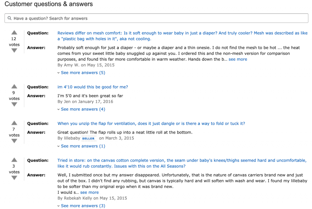
If you’re only getting started with creating content for your company, then FAQs are likely a great start. After a listing and the product copy on Amazon, you’ll always find a section containing “customer questions & answers” around the product. They even have upvotes for the answers and let their buyers help each other (customers share such information for free because of their altruistic motivations as I mentioned in the review request article).
Here’s an example FAQ section from a Baby & Child Carrier Amazon listing. A few answers are genuinely helpful.
Still not convinced if you need a FAQ page? Then, hear me out in the next section.
Why Is FAQ Important?
A core tenet of content marketing is answering the questions of your audience, and an entrepreneur that knows it well is Mr. Marcus Sheridan. He saw a large number of prospects that wanted to do business with his company, River Pools, ask him the same question: “How much does a Fiberglass pool cost?”
So he went ahead and created a blog post that answered the question. He also created a “pool buying guide” eBook to go with it. The blog post alone was attributable to generating $2 million in sales for his company!
How’s that for ROI?
FAQs can also:
- Improve your site architecture and overall SEO,
- Show the personality of your brand by answering questions in your voice (yes, you can get creative!),
- Convert an on-the-fence prospect into a customer by answering their additional concerns (that you didn’t cover in your product copy).
Now that you’re convinced about the utility of FAQ pages let’s look at a few brilliant examples of brands doing it right. Later on, I’ll share actionable steps to put up a scintillating FAQ page on your site.
5 Best FAQ Pages You Can Learn From
Here are a few brands that are using FAQ pages in their content strategy and doing a great job at it.
1. Death Wish Coffee
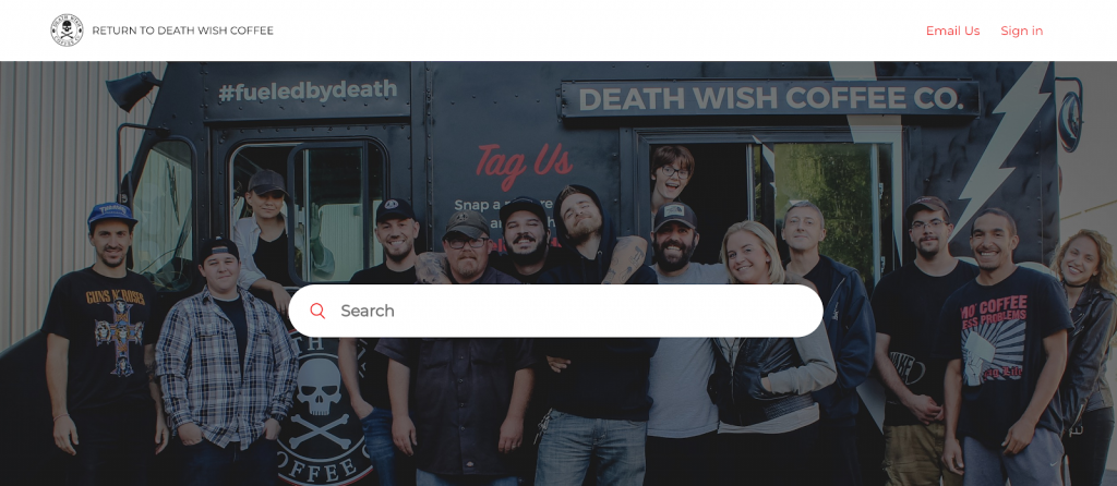
Death Wish Coffee has created a dedicated help page with Zendesk. It’s easily accessible from the navigation bar at the top of their site. You can also find it under ‘common questions’ as a footer link.

When I log in to the page, I am greeted with a search bar laid on the top of a happy Death Wish Coffee team picture. It’s inviting and gives a human touch to the desk.
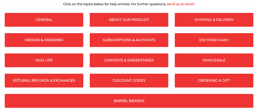
Below, you’ll find a list of topics that classify the questions into sections. They also welcome further questions through the link to their contact form via the hyperlink in “send us an email.”
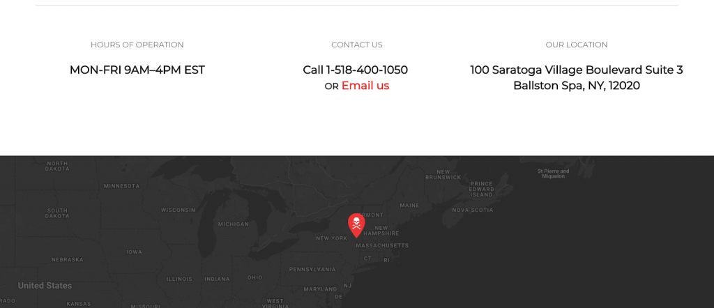
On another scroll, you’ll find their contact details, operations hours, and their full address along with their location on the map.
Their questions are occasionally not even grammatically correct but written how we speak to engage the readers. For example: “Free Samples?”
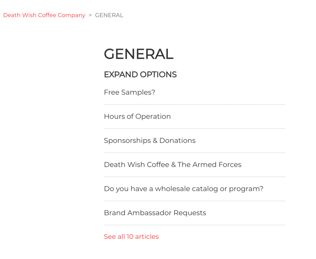
Notice how the answer to the question “Free Samples?” is written in a casual and conversational tone.
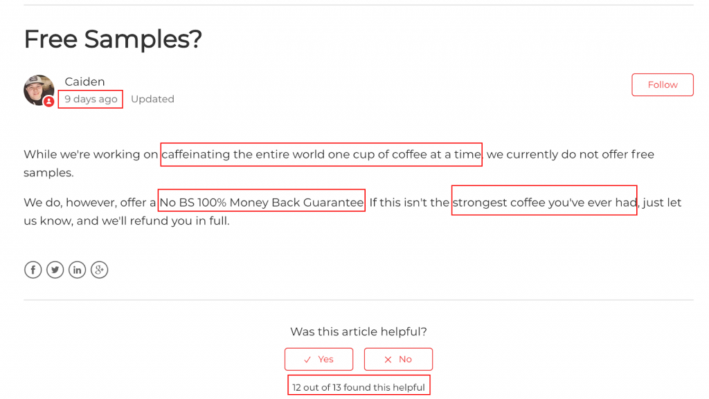
The answer ticks off a lot of boxes that many brands get wrong:
- It displays a date at the top to confirm that the company representative put efforts into these pages. There’s social proof at the bottom as well.
- They respectfully show the freeloaders outside the door. Indeed, the brand does it with panache using phrases like “caffeinating the entire world…” and “strongest coffee you’ve ever had.” (I am SOLD already).
- The page reinforces their 100% Money Back Guarantee that might give peace of mind to those prospects still not sure about buying their coffee.
In the question below, they directly address the negative connotation associated with their name. Notice how they end the question with links to related questions (great for SEO!) and even a CTA to purchase their coffee.
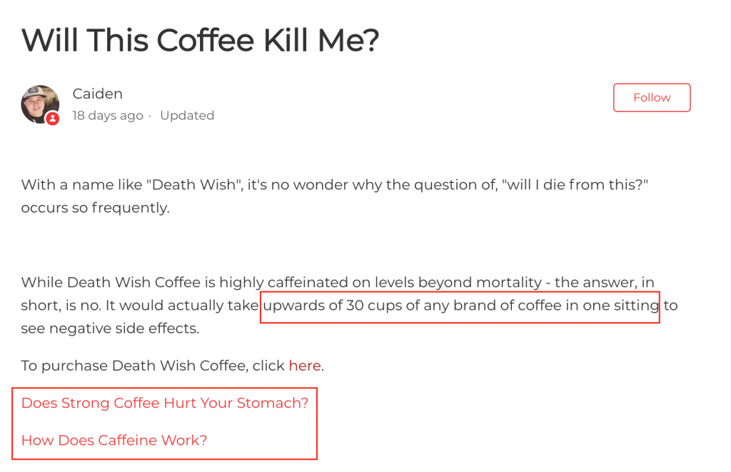
Overall, the brand has nicely integrated their FAQ and contact pages.
2. Quip
Next up on our list is Oral Care Service provider, Quip. They have a link to their FAQ page at the top in their navigation bar.

They also have a section titled ‘Frequent Questions’ at the bottom with answers to (likely) their top 3 most asked questions. It’s followed by a CTA to their dedicated FAQ page.

The layout of their dedicated help page is similar to Death Wish Coffee. They have a search bar at the top followed by links to specific sections for exploring more questions. The overall design and the user interface of the page is minimal and embodies the brand colors.
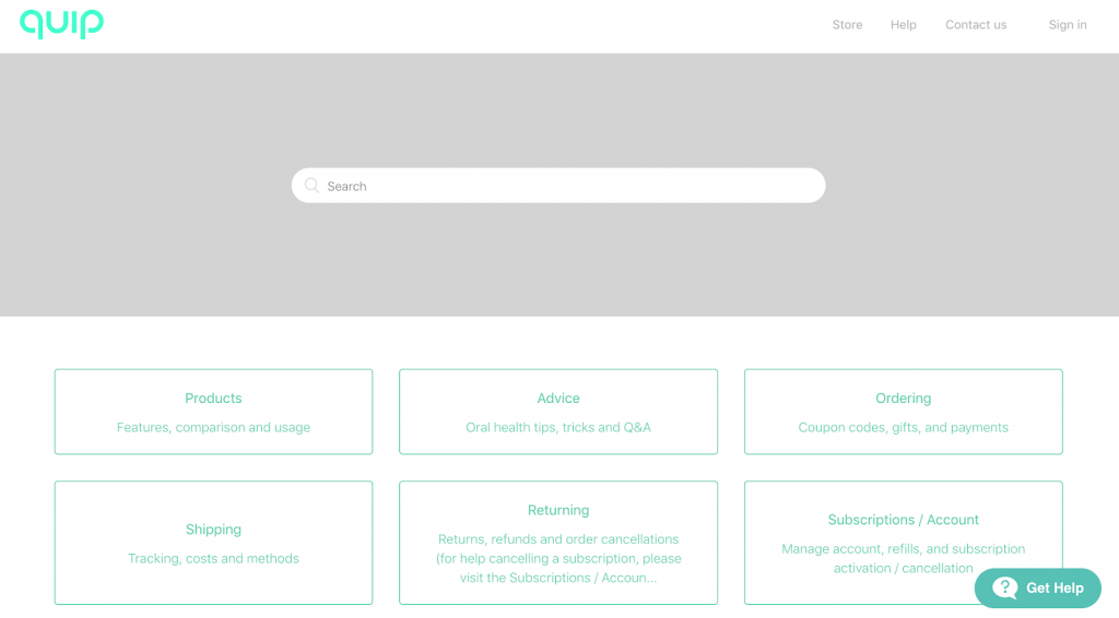
Further down, you can glance at a chosen few “Frequently Asked Questions” – they are likely the most frequent among the Frequently Asked Questions.
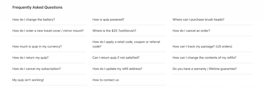
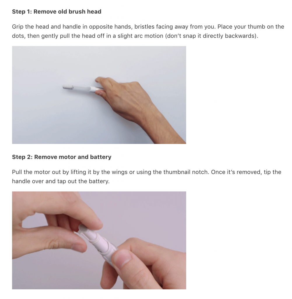
They also have a community section at the bottom, but it isn’t as active. Their product involves complex activities like changing batteries. They don’t shy away from using GIFs in their answers to demonstrate the product functionalities in a step-by-step manner.
They use an image elegantly even in their answer to the dimensions of a quip brush.
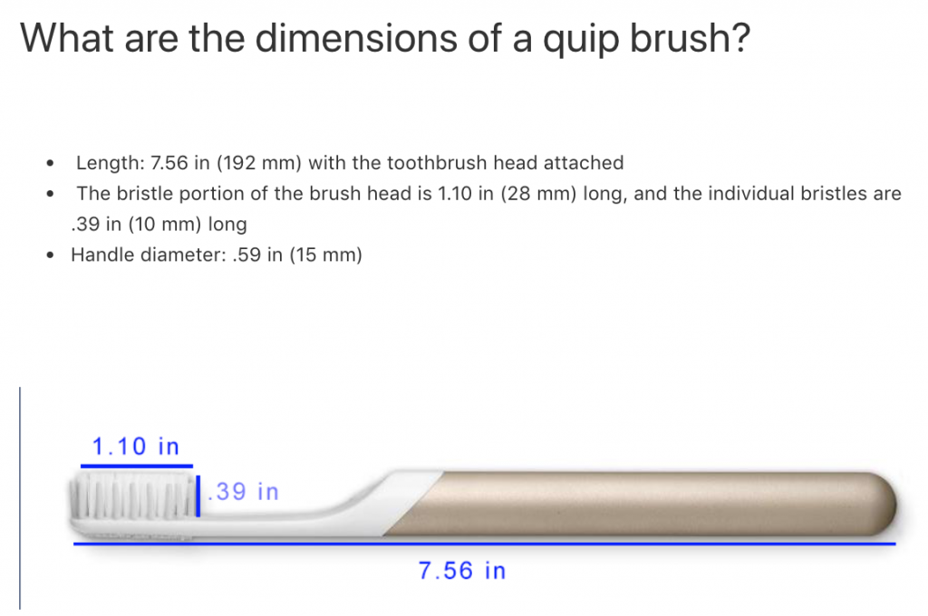
Kudos to Quip for showing how to use multimedia on your FAQ page.
3. McDonald’s Canada
While fast food from McDonald’s is not healthly, you can take lessons from their FAQ page and the marketing efforts surrounding it.
In 2012, McDonald’s Canada launched a campaign called “Our Food. Your Questions.” It was a video campaign that addressed the rumors around the brand’s quality of food, its product packaging, and information about the operations of the company.

The campaign was meant to promote transparency through social media and put myths surrounding the brand offerings to rest. It was launched as a video campaign, and the answers were put up on their YouTube channel. The users were invited to send their questions to the brand. Here’s a video that addresses apprehensions of a customer regarding the difference of their food in real-life compared with their advertisements.
When the Director of Marketing takes you behind the scenes of the company, it can shoot up the trust of customers in your brand.
Today, their FAQ section allows you to perform an interactive search. While you type keywords, related questions also pop up.
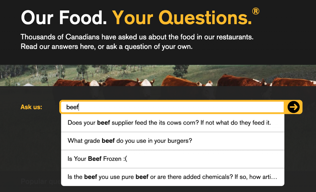
They still allow their customers to ask questions and post their answers publicly on the page. As all the questions have names and photos attached alongside them, the FAQ page looks authentic.
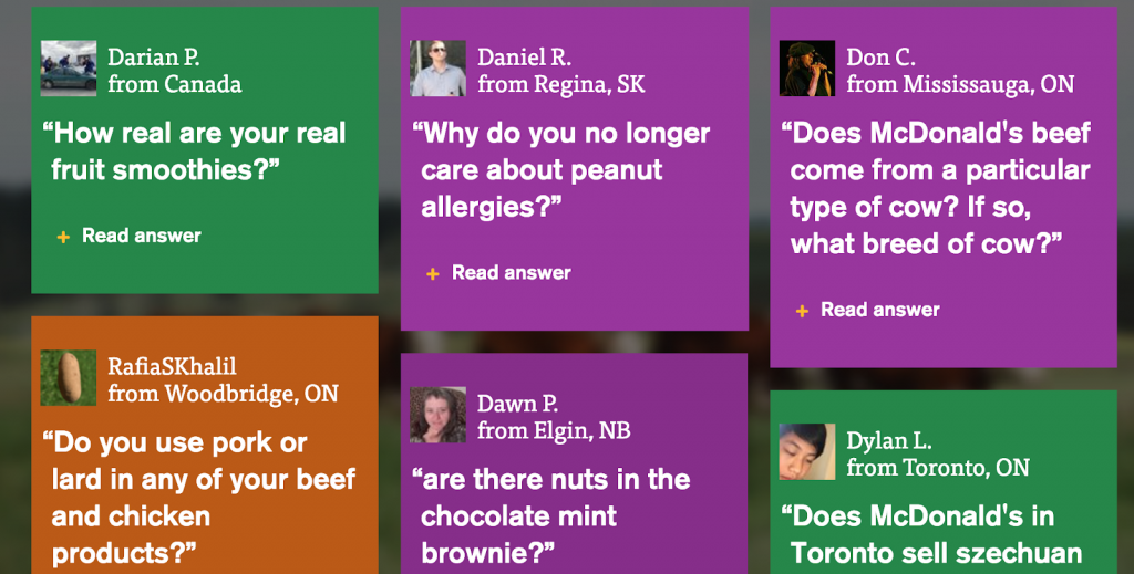
Although the answers are written under the brand name, the tone is conversational.
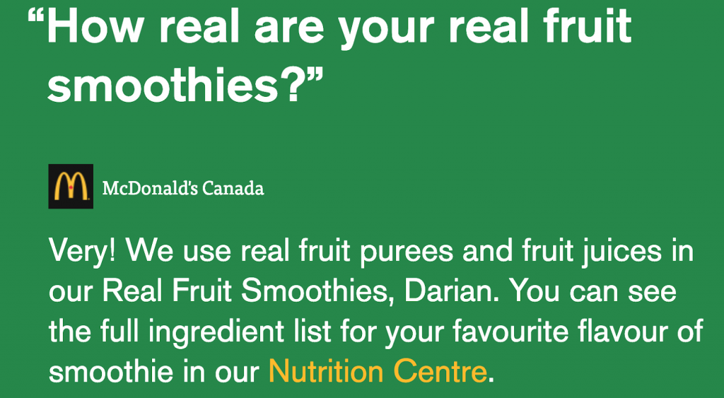
Overall, McDonald’s Canada did a great job with the marketing campaign and won an award for it. No wonder, “Our Food. Your Questions” was later replicated by McDonald’s USA to gain more trust from its consumers.
4. FATCO
The FAQ page of Fat Co is accessible from the top navigation bar and in the footer of the site. While they don’t have a lot of questions on the page, it’s easy to scan and visually heavy.
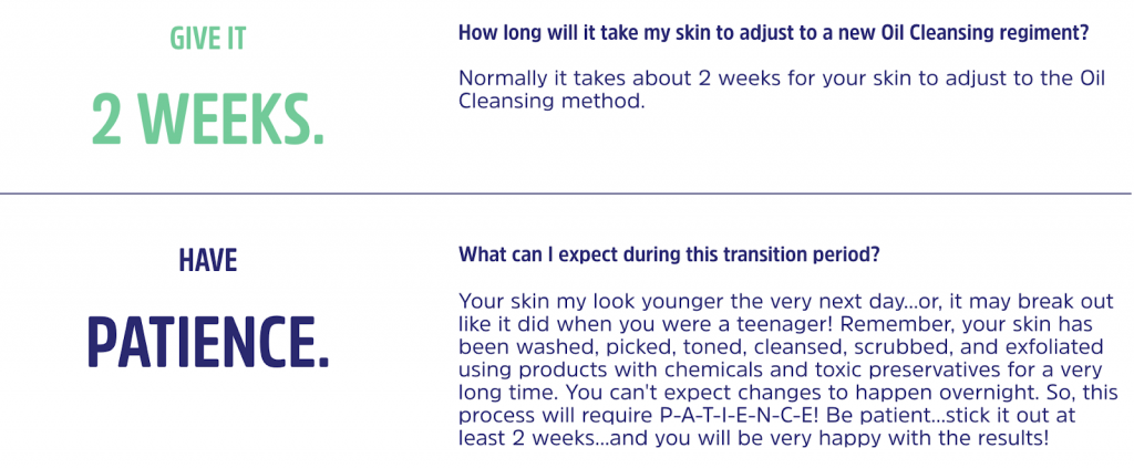
Even without reading the questions and their text answers, the graphics form a narrative that addresses the common apprehensions of their beauty care product.
If you vertically scroll through the page, you can get a quick overview of the intricacies of the product.
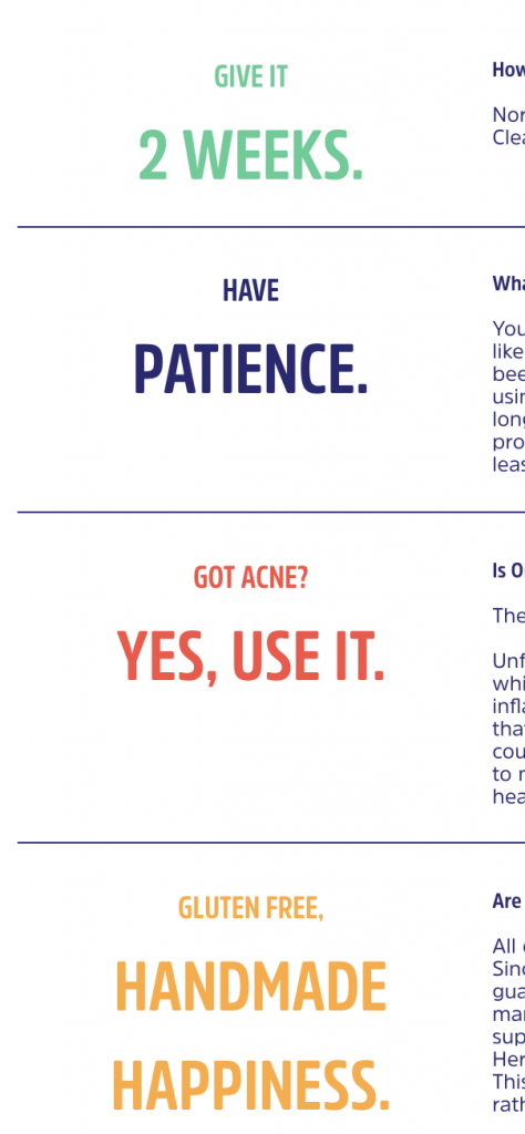
Within seconds, you know that:
- Your skin needs two weeks of FATCO usage for adjusting,
- You can use it despite having acne,
- Also, the product is gluten-free.
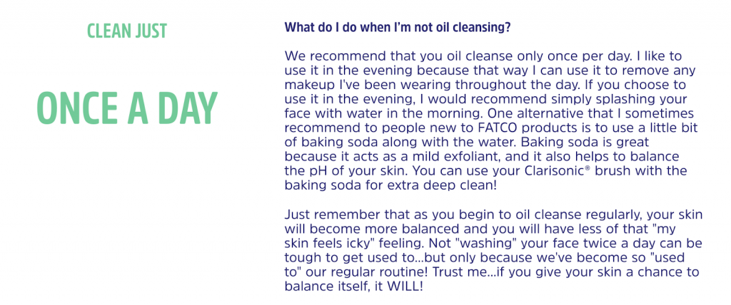
For the answers that need more clarity and detail, FATCO goes in-depth alongside the graphical summary. For example, here’s the answer to “What do I do when I’m not oil cleansing?”
If you get relatively few questions around your brand offerings, then FATCO shows you how to create a crisp FAQ page.
5. Cards Against Humanity
Can you pull off a sarcastic tone and get away with insulting your customers?
Nope.
Unless you’re a brand like Cards Against Humanity.
Essentially, they offer playing cards. Or as they would like to put it “a party game for horrible people.” As their name suggests, they are often associated with offensive and politically incorrect phrases.
Due to their brand image, they can afford a rather caustic tone of voice on their FAQ page. To access it, you need to scroll to the bottom of their homepage. The title “Your dumb questions” grabs the attention and would work well with their target audience.
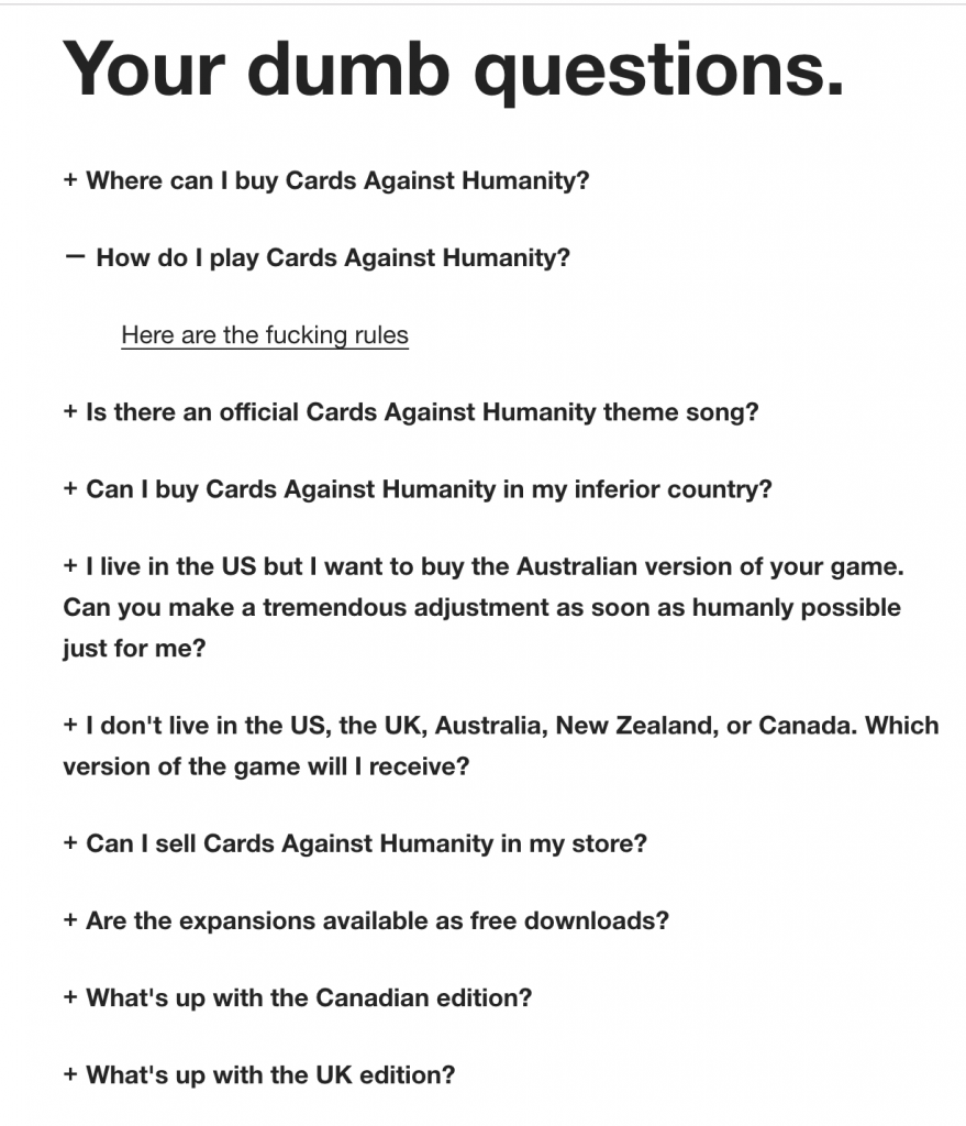
They don’t mind swearing, and they pull off an arrogant voice in their answers effortlessly as you can see below.
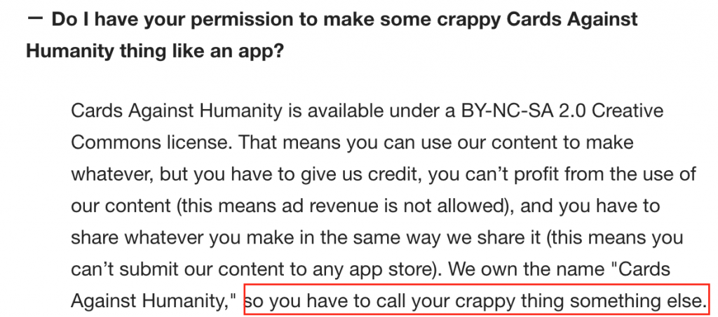
They have a separate FAQ page for their store as well. And the brand maintains the same tone of voice in their answers over there.

Cards Against Humanity do a great job of using humor and sarcasm on their FAQ page. It’s not easily replicable for your brand if your audience is overly sensitive.
Now that you have an idea of great FAQ pages let’s look at the specific steps to create yours!
How To Create A Scintillating FAQ Page For Your Brand?
If you repeatedly receive the same kinds of questions about your products, it can lead to obstacles in buying from your store. In such a case, an FAQ page can facilitate further engagement with your brand and smoothens your customer’s journey. Here are a few aspects you can consider to get started.
Research the most common questions of your audience
Interact with your support and sales team that directly talk with your customers. You can also check the support tickets that are often raised. The idea is to educate a prospect about your products if they have objections. You can also re-engage your existing customers.
Consider a dedicated help desk
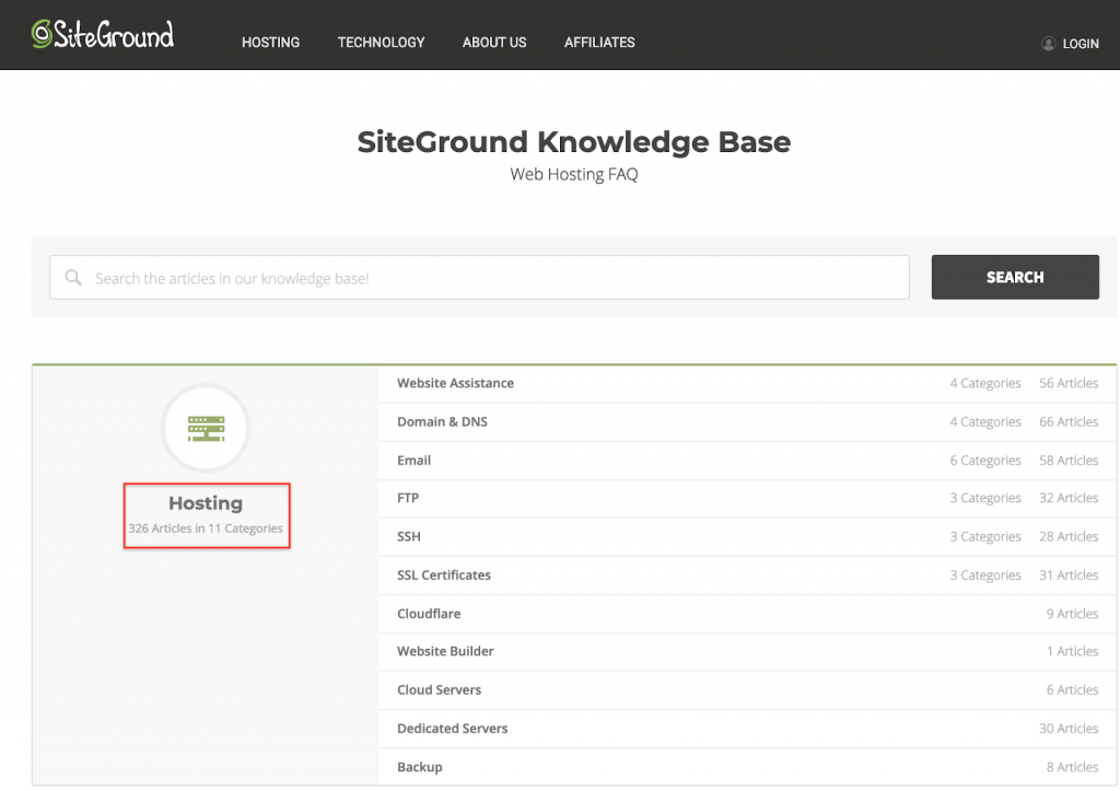
If you find LOTS of questions, then you can divide them into categories for the ease of navigation and create a dedicated help desk. For example, the knowledge base created by Siteground touches many subjects. There are 326 Articles in 11 Categories under “Hosting” alone.
Embody your brand voice while answering
When you start a brand, you often know how you want to be perceived by your audience. The FAQ page needs to carry your brand voice and written in an engaging style that appeals to readers.
Keep it succinct and choose a format that works the best for your audience
Depending on the complexity of your offerings, it might make sense to use images and videos in your answers. Your audience is short of time, so try to use as few words as possible. Overall, the page should appear elegant and inviting.
Don’t forget SEO, social media, and your contact page
A primary reason for the resurgence of FAQ pages is virtual assistants and voice search. So don’t forget to be mobile-friendly, show related questions (if you have a dedicated page for every question), and optimize your page for the phrases your audience is keying inside Google.
You can also add social media share buttons and interactive content elements (like a question “Was this helpful?”) to your pages. Lastly, as your users can always have a unique query that isn’t a FAQ, it makes sense to give your email/put a contact form for inviting them to ask you newer questions.
And there you have it:
That’s how you can create your FAQ Page that impresses and connects with your prospects.
Go Ahead And Create A FAQ Page For Your Brand Now!
FAQ Pages are a great opportunity for your brand to engage both your existing customers and the prospects on-the-fence about products. You saw the other associated SEO and branding benefits of the pages as well.
Now, it’s your turn to create a FAQ page and help smoothen your buyer’s journey. Remember to stay succinct and not be afraid of showing off your brand’s personality.
What’s your personal favorite brand FAQ page? And have you ever considered them for your Ecommerce store? Let me know in the comments below.
Companies our team has worked with:


